Showing posts with label Research. Show all posts

Wednesday, 31 August 2011

School Mural

I've just been sorting through some drawings done by Year 4 pupils at Hayes Lane Junior School ready for my personal project. I asked them to draw what their dreams for the future were and below is a small selection of my favourites.....


The response from the pupils was amazing with 84 drawings in total and some really interesting career choices. I now have the mammoth task of creating a mural for the side of a garage near the main playground so no pressure!

Saturday, 7 May 2011

Rushmore Continued

Since the last posting about the 8x8 project a lot has happened. Jo gave me some good feedback on how I could improve my two images so I've done a few changes. Yesterday we met with Gary and the guy from MMU to show our images and explain our thoughts behind them. The meeting went well and we must wait until Tuesday to find out who's images will be selected. I will include the outcome next week so watch this space.

Rushmore Final....Well Almost!


I've just finished my two illustrations for the Rushmore story and I'm really happy with how they've turned out after Photoshopping the final elements together. I decided to do both in watercolour so they look the same when printed. It's been a while since I painted anything in the traditional sense so the process took me a lot longer than usual. I still have some effects to apply to the picnic scene to make it look more weathered but thought I'd post what I've done so far.


Monday, 25 April 2011

Music Live

We also have another brief running alongside the 8x8 brief. This one was set by Manchester design studio Music who have asked us to create artwork for the outside of their conference room. The room is glass fronted and quite a large area to cover so for this brief I'm teaming up with fellow classmates Megan Thomas and Dominique Byron.

One of the conditions of the brief was we had to choose a music track to illustrate, so through the power of Skype we had a meeting and decided to choose Daft Punks "Harder Better Faster Stronger".

Were having a group meeting on Tuesday morning to discuss any ideas we have so will make an update of any further developments.

Rushmore

The current brief I've been working on for the past few weeks is a collaboration with writers from MMU where we were asked to create an illustration for a short story. The story I'm illustrating is "Rushmore" written by Robert Cowan. The story is set in the future where the planet has been affected by radiation poisoning and the rich and influential have fled the planet leaving behind the poor who become sick. The main character is a corporal named Jack Rushmore who is left in charge of a small office where he has to power to grant visas illegally for his own gain.

We got a chance to meet with the writer and were able to run through some of our initial ideas and ask some questions about the story.

When talking to the author he mentioned a poem that is referenced in the story. The poem is called "The Lime Tree Bower My Prison" by Samuel Taylor Coleridge.

The poem is about Coleridge who wallows in self pity as he is unable to go on a journey in the country with his friends. Limited to sitting under the lime tree he uses the power of his imagination to alter his perception and takes himself on the journey with them. At the end of the poem he realises that nature can be found anywhere even under the lime tree bower that he once felt so confined.

I guess this links in with Rushmore as he is trapped on a dying planet with no immediate means of escape and has to make do as best he can.

My plan was to recreate the image of a family enjoying a picnic under the lime tree bower which symbolises a time when the world was a happier place and nature flourished. Below is my inked version, which I'm planning to do again in watercolour to give it a softer feel.


Monday, 14 March 2011

Tom Bancroft


This book really helped me develop my character for the Disney brief. It's called Creating Characters with Personality and is written by animator and character designer Tom Bancroft.

I must admit I didn't know much about him before I bought the book, but like most people once I turned the pages I realised I was familiar with his work. It's really well written with some great character sketches, hand written notes and character assignments. One chapter that was really valuable to me was "Pushing Your Design" because it helped me to develop a sketch I liked into something with more visual appeal.

Tom has over 20 years experience in the animation industry, 11 of those years was working for Walt Disney feature animation where he contributed to many feature films including: “Beauty and the Beast,” “The Lion King,” “Aladdin”, “Pocahontas”, “Mulan”, “Lilo and Stitch”, and “Brother Bear”.

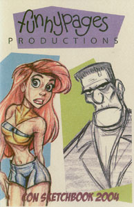
Tom founded Funnypages Productions with friend Rob Corley. The company has provided illustration, character design and artistic animation development for clients like Disney, Big Idea Productions, CBN, Scholastic, Warner Brothers, Simon and Schuster Publishing, and Hasbro.

Please check out his Funny Pages website here: www.funnypagesprod.com

Wednesday, 2 March 2011

Lesson learned


Sadly I've had to make the decision not to enter the D&AD competition after all. It's a bitter pill to swallow as I've put a lot of work into it was keen to see if I made it to the next round. After a long day of pouring over the above scene I found I only have 6 seconds worth of animation and simply cannot afford to invest any more time on it before Friday. In hindsight I should have started animating as soon as I had the character finalised, but I think I'm gonna have to chalk this one up as a lesson in bad planning.

On a positive note though I really enjoyed working out the sequence for the 6 seconds I have and am really proud of the way it turned out. I think I should try and finish it in my own time and send it to the guy at Disney for some feedback.

Monday, 31 January 2011

The Monster Engine

Just thought this tied in well with my ideas for the competition brief.
Dave Devries is an illustrator who has worked for the likes of Marvel and DC Comics. He came up with an idea of turning children's drawings into finished artwork and created a book called the Monster Engine.

Monday, 24 January 2011

Cheese

Foster's Home For Imaginary Friends


Have been looking at different cartoons as part of my research for the Disney brief (it's a tough job I know) This montage of clips from "Foster's home for imaginary friends" shows a child like monster called "Cheese" that really gets on peoples nerves. The characters are kept really simple but the mannerisms and personality are what makes it so good.

Friday, 14 January 2011

The Tackle of the Tentacle


I think it's really important to think about the environment and make a difference where we can. Here a group of artists in Ljubljana, Slovenia made this giant monster from plastic bags and plastic cups to symbolise the spreading of consumerism and waste pollution.

The monster was made from 40,000 used plastic bags and 7,500 used plastic cups.

I like the way the tentacles stretch out around the city forcing people to notice it like the image of the lady with the pushchair.

Here is their monster profile:

"The monster itself has adjusted to the environment and therefore survived. It is supplanting us from the food chain. It just might succeed and it's all up to us. It is reproducing with inconceivable speed and knows no mercy. It feeds on individuals sloth and irresponsibility"

More info can be found here

Thursday, 13 January 2011

Competition Briefs

I've just had a sneak peek at the competition briefs on Moodle and have two in mind already.....will have to check if they are the correct ones, but so far liking either the Puffin digital picture book or the D&AD interpretation of a music track.

Life Drawing


I haven't been to a life drawing class in ages which I really miss. One new years resolutions is to draw more people and build up a sketch book dedicated to life drawing to increase my accuracy and speed.
I recently came across the work of Florian Nicolle and thought I should feature him in my blog, his website is in French, but i managed to find some info about him in the ref below along with a link to his website.
There is a strong element of gesture drawing which looks really fluid, I like the fine detail that's added in watercolour. Also liking how he uses different paper textures and newspaper print which I think were layered over the top digitally.

Florian Nicolle (neo) is a a young french Graphic Designer and Illustrator. He’s 22 and currently lives in Caen (France), planning to move to Paris. He is a Graphic Design graduate and while on his course, he developed a strong passion for illustration. Now illustration is his main route in the industry.

Skotti Young


I've been looking at a lot of comic book art recently because the detail that goes into these masterpieces is just so eye poppingly good. One illustrator I really like the style of is Chicago based Skotti Young.

I read a lot of Marvel and DC comics in my early teens, my favourites were Batman, Spiderman and Ironman. It's been a while since I've picked up a comic book but It's nice to see modern day comic artists putting their own stamp on old classics.

Young's style looks modern and fresh, I like how sometimes there is a rough sketchyness of line in some of his work and textures that have been layered on digitally.

Lane Smith


Over the Christmas holidays I wrote an essay for Critical Studies on the theme of post-modernism. The brief asked me to choose a designer from my pathway area that I thought had made a significant contribution to contemporary design.

The Illustrator I chose was Lane Smith born in Oklahoma 1959. Lane has illustrated and written loads of children's books and also had work published in the New York Times, Rolling Stone and Regardies Magazine. He has also been involved with some well known children's films working as a concept artist for Roald Dahl's film adaptation of "James And The Giant Peach" and art director for Disney Pixar "Monsters Inc".

There is a strong use of surrealism and dark humour in his work, which is something I really like and reminds me of comedies like Monty Python and The Mighty Boosh. I really want to give oil paint a try after looking at these images.

Monday, 10 January 2011

Happy New Year!

Ok first blog of the new year.......had a really busy but amazing festive break travelling backwards and forwards to North Wales visiting family and friends, but managed to find time to read, draw and kick back.

Got a really good book for Xmas by Jon Burgerman "Pens are my friends" which I have only flicked through so far and actually can't find at the present moment as my computer room is littered with paper, books and the kids dressing up clothes, but rest assured once I find it my blog pages will be littered with images and comments on how cool this book is.

I went to Fred Aldus last week and bought some awesome manga pens which I have been experimenting with and love the look of. The Aqua pens are not my friends at the moment as they don't seem to create the affect as seen on the box....I'm thinking of trying brush and water with them to see what happens.

Thursday, 9 December 2010

Dialogue ignites change

http://www.youtube.com/watch?v=nqkvftkRLaQ

I have been researching into neighbour disputes for the Dialogue ignites change brief. Most people I have interviewed said the disputes are still ongoing or they or the neighbour had moved out thus solving the problem. I have been looking into mediation as a means to help people to start talking again and have come up with an idea for a mobile unit that can go direct to the conflict.

Monday, 22 November 2010

Jean Julien


Jean Jullien is a French graphic designer who lives in London. He studied graphic design in Quimper before moving to London. He graduated at Central St Martins in 2008 and the Royle College of Art in 2010. His practice ranges from illustration to photography.

Simple shapes and bright colours really make his work stand out, I particularly like the above comic strip "The House" as it is plays around with shapes taking the viewer away from the conventional comic strip format. At 1st you see the over all shape of the house then read what's going on inside......really clever idea!